
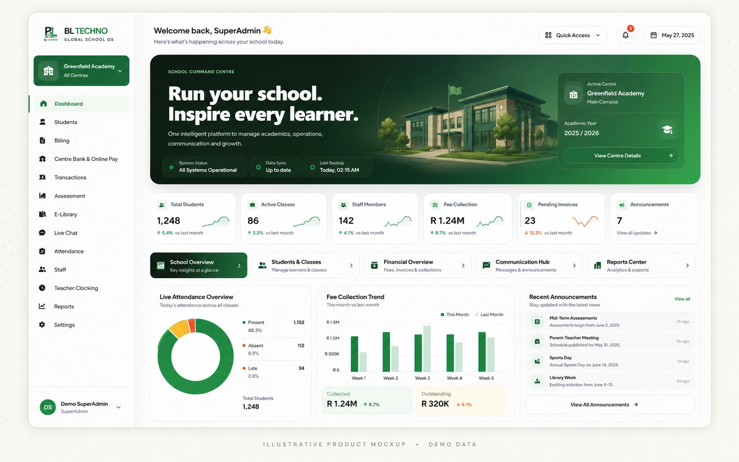
Desktop / Tablet
Management
Dashboard, students, centres, finance visibility, users and school command.
Explore Management →
Management may work from a desktop, teachers from tablets, learners from phones and drivers from mobile devices. BL TECHNO's responsive story adapts the presentation to the role instead of squeezing one interface into every screen.
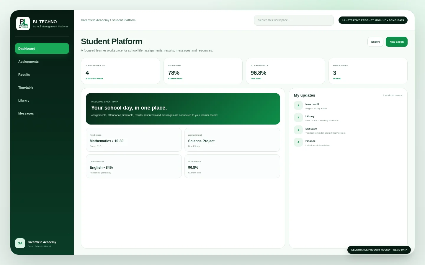
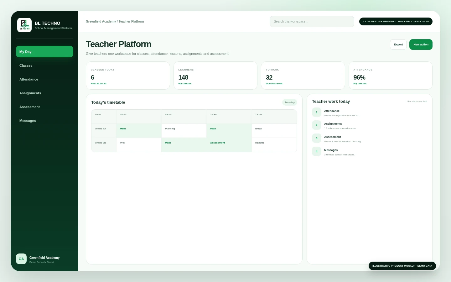
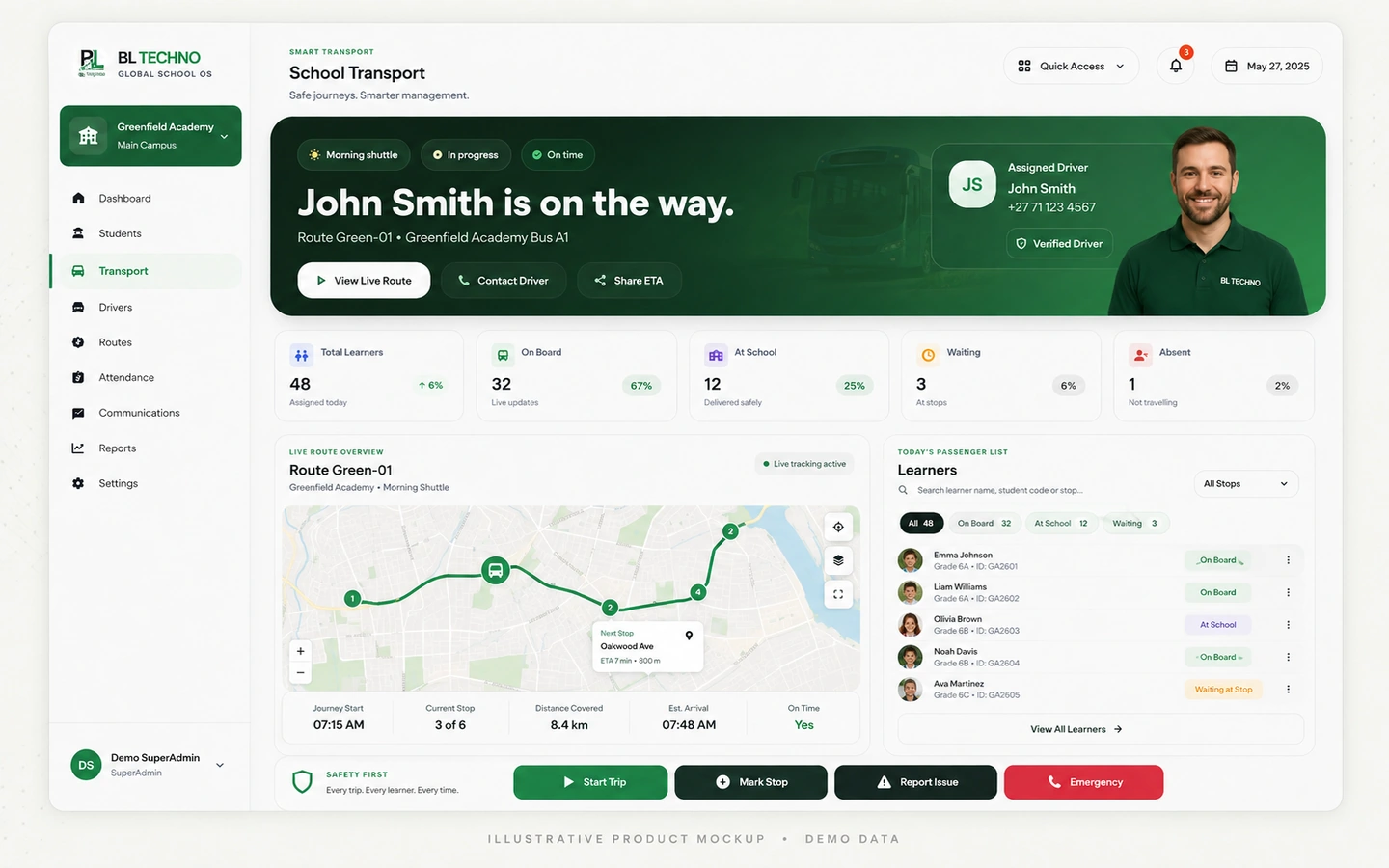
The goal is not visual sameness. The goal is to keep the right actions clear, readable and touch-friendly for the person using the device.
Dashboard, students, centres, finance visibility, users and school command.
Explore Management →Classes, attendance, assignments, assessment, lessons, reports and communication.
Explore Teacher →Assignments, results, timetable, resources, messages and school information.
Explore Student →Assigned routes, learner trips, pickups, drop-offs and authorised transport operations.
Explore Driver →BL TECHNO's public design direction prioritises readable hierarchy, touch targets, reflowing layouts and role-focused actions on smaller screens.
These role examples show how the same school context can support very different device situations.
A teacher or authorised school user marks attendance from a tablet or mobile device.
Class and learner context supports assignments, assessment and teacher workflows.
A driver uses an authorised mobile workflow for the assigned school trip.
Learners and families can access relevant school information from their own devices.
The marketing and product interfaces should be tested across narrow phones, larger phones, tablets and desktop layouts before public release.
We can focus the demonstration on management, teacher, learner, finance or transport experiences.
See how students, attendance, assessments, billing, staff, payroll, access, communication, library and transport connect in one school system.
Learn what approved Agents represent, how the onboarding journey works, and where to register or sign in to the live Agent system.
BL TECHNO is one global website. We suggest your country automatically so pricing can be shown in the local currency, and you can override the suggestion at any time.